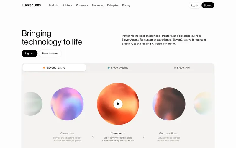
62% match
Similar because both use dark interfaces and a restrained, near-monochrome palette.


From framer.com

wve.la
Digital growth and marketing partner turning culture into measurable business outcomes.
https://wve.la/
Similar because both use dark interfaces and high-contrast typography.
Product-facing similarity scores, not statistical measurements.
A balance of how it looks and what it is.
Similar because both use dark interfaces and a restrained, near-monochrome palette.
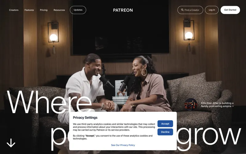
Similar because both use a monochrome aesthetic and a premium aesthetic and both are Marketing sites.
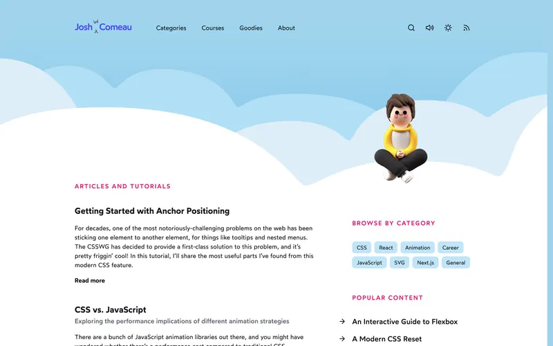
Similar because both use a restrained, near-monochrome palette and minimal layouts with generous whitespace.

Similar because both use dark interfaces and high-contrast typography.

Similar because both use high-contrast typography and dark interfaces.
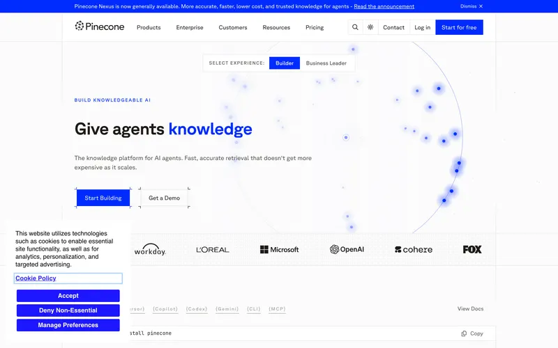
Similar because both use high-contrast typography and a dark aesthetic.
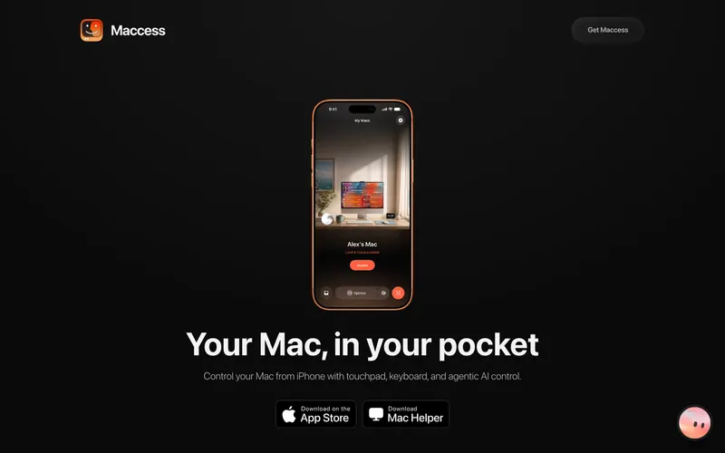
Similar because both use dark interfaces and minimal layouts with generous whitespace.
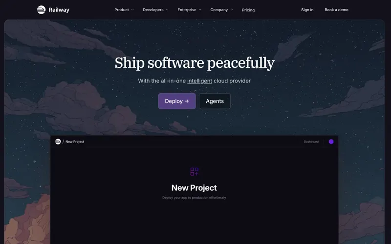
Similar because both use a restrained, near-monochrome palette and minimal layouts with generous whitespace.
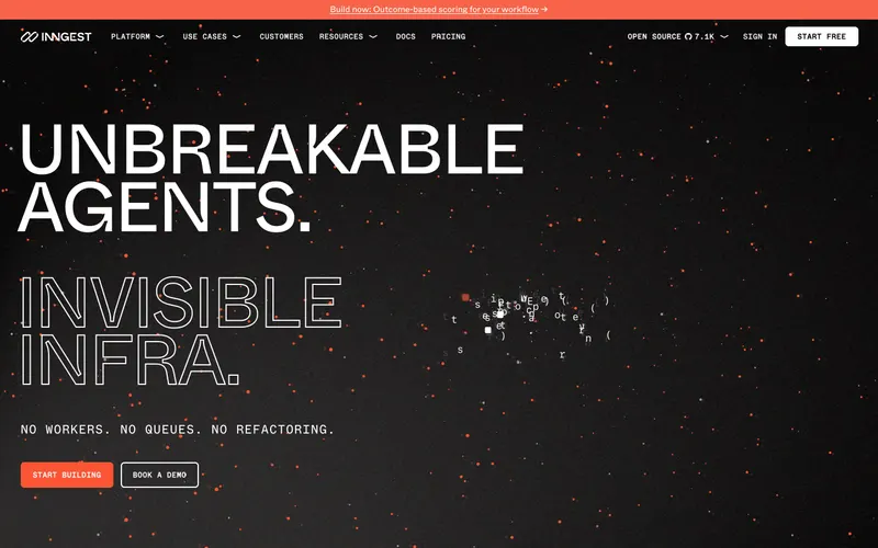
Similar because both use dark interfaces and a restrained, near-monochrome palette.

Similar because both use dark interfaces and a restrained, near-monochrome palette.

Similar because both use minimal layouts with generous whitespace and a restrained, near-monochrome palette.
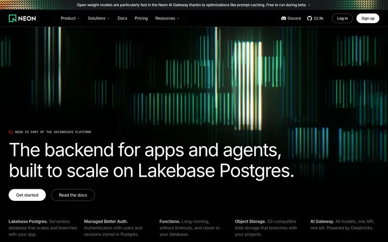
Similar because both use minimal layouts with generous whitespace and dark interfaces.

Similar because both use a restrained, near-monochrome palette and dark interfaces.
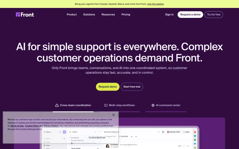
Similar because both use high-contrast typography and a product-led landing page structure.

Similar because both use minimal layouts with generous whitespace and a minimal aesthetic.
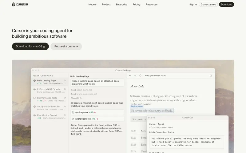
Similar because both use a minimal aesthetic and a product-led landing page structure.
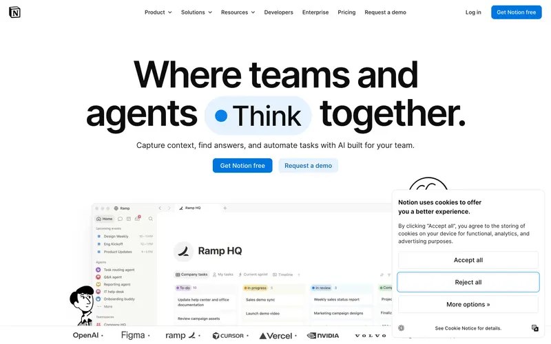
Similar because both use high-contrast typography and a minimal aesthetic.
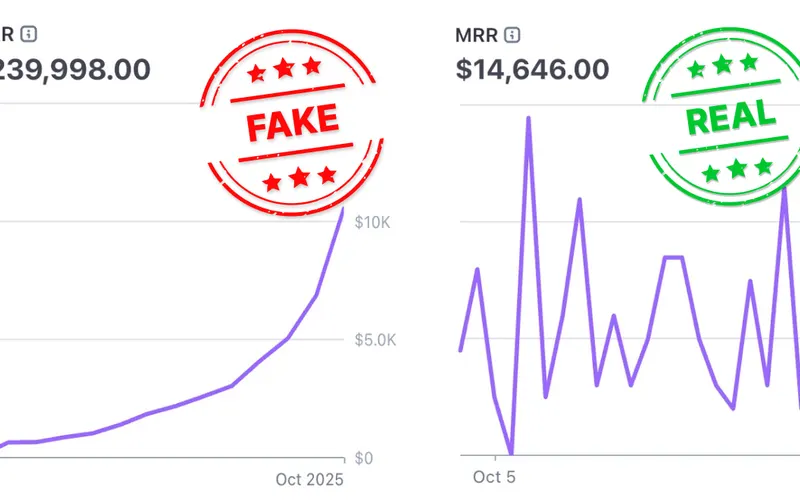
Similar because both use dark interfaces and a dark aesthetic.

Similar because both use high-contrast typography and a minimal aesthetic.

Similar because both use a minimal aesthetic and a premium aesthetic.
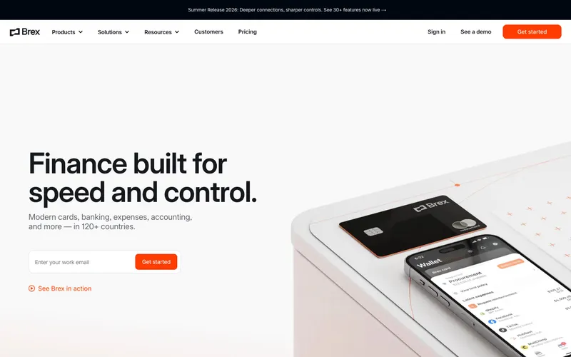
Similar because both use minimal layouts with generous whitespace and a dark aesthetic.
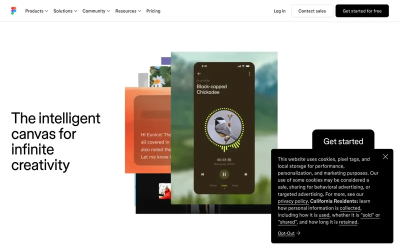
Similar because both use minimal layouts with generous whitespace and a minimal aesthetic.
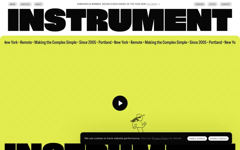
Similar because both use minimal layouts with generous whitespace and a minimal aesthetic.
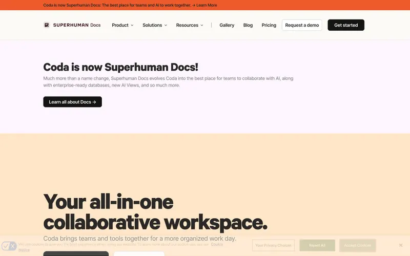
Similar because both use a premium aesthetic and a product-led landing page structure.