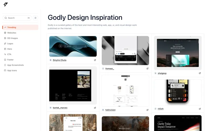
71% match
Similar because both use light, airy interfaces and a minimal aesthetic, both are Design sites, and both target Readers and Designers.


From miro.com
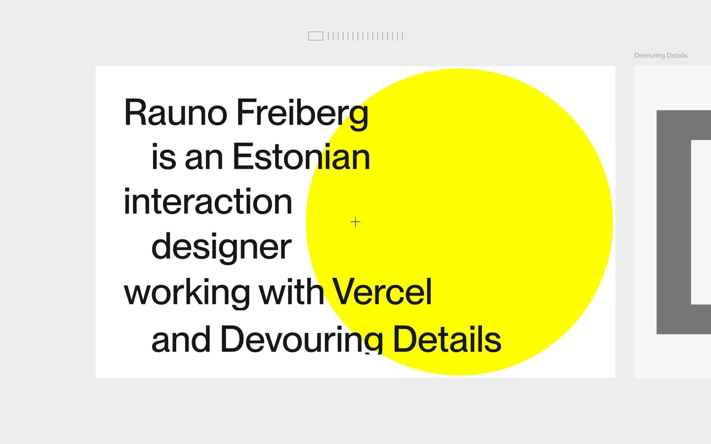
rauno.me
https://rauno.me/
Similar because both use high-contrast typography and a minimal aesthetic, both are Design sites, and both target Readers and Designers.
Product-facing similarity scores, not statistical measurements.
A balance of how it looks and what it is.
Similar because both use light, airy interfaces and a minimal aesthetic, both are Design sites, and both target Readers and Designers.
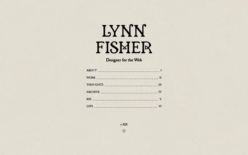
Similar because both use a minimal aesthetic and a light aesthetic, both are Design sites, and both target Readers and Designers.

Similar because both use high-contrast typography and a minimal aesthetic, both are Design sites, and both target Readers and Designers.
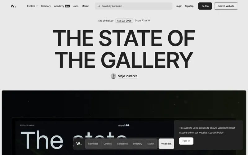
Similar because both use light, airy interfaces and a minimal aesthetic and both are Design sites.
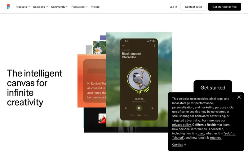
Similar because both use a minimal aesthetic and a light aesthetic, both are Design sites, and both target Readers and Designers.
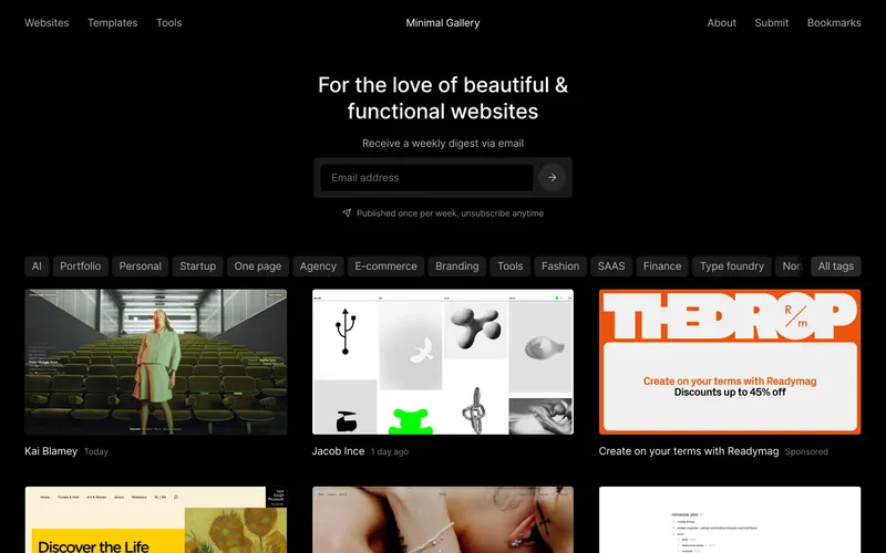
Similar because both use light, airy interfaces and a minimal aesthetic, both are Design sites, and both target Readers and Designers.
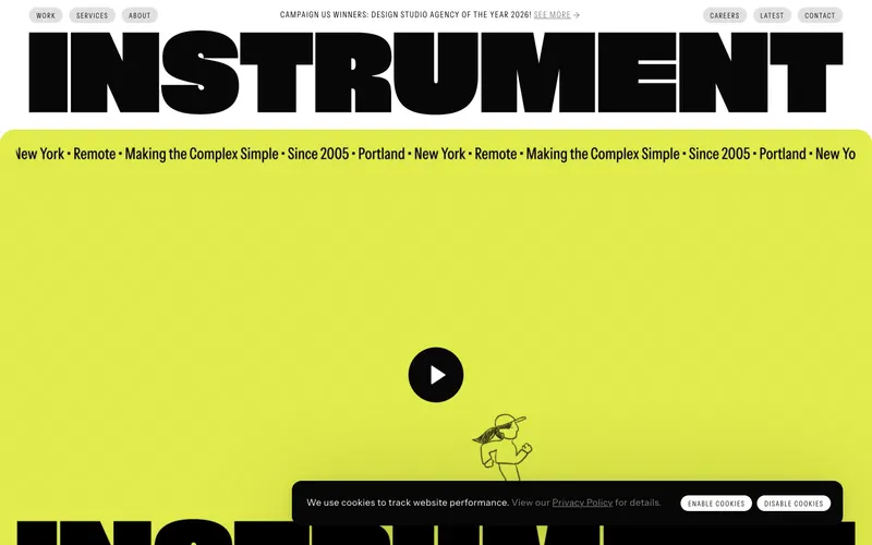
Similar because both use a minimal aesthetic and a light aesthetic and both target Readers and Designers.
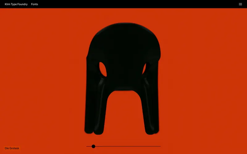
Similar because both use a broad consumer audience and a minimal aesthetic and both target Readers and Designers.
Similar because both use a minimal aesthetic and a light aesthetic and both are Design sites.

Similar because both use light, airy interfaces and a broad consumer audience and both target Readers and Designers.

Similar because both use high-contrast typography and a light aesthetic and both target Readers and Designers.
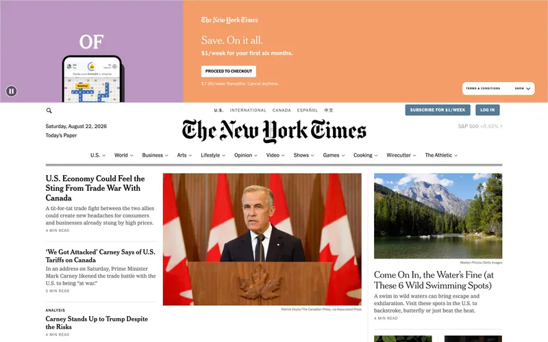
Similar because both use high-contrast typography and a light aesthetic and both target Readers and Designers.
Similar because both use light, airy interfaces and a light aesthetic and both target Readers and Designers.

Similar because both use a minimal aesthetic and a light aesthetic.
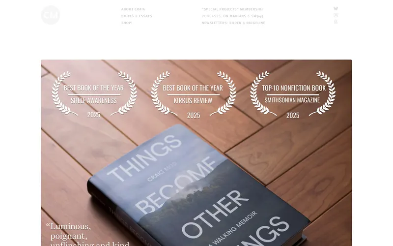
Similar because both use light, airy interfaces and high-contrast typography and both target Readers and Designers.

Similar because both use light, airy interfaces and a broad consumer audience.
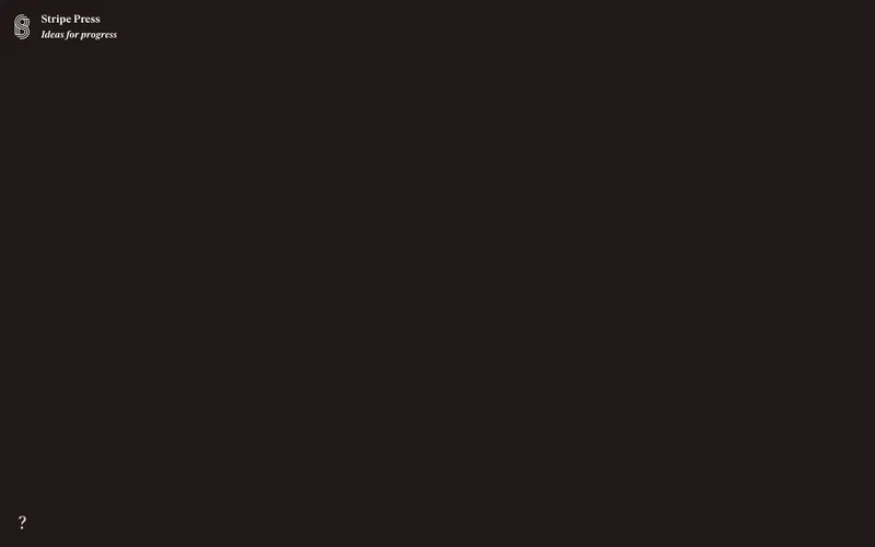
Similar because both use a broad consumer audience and high-contrast typography.
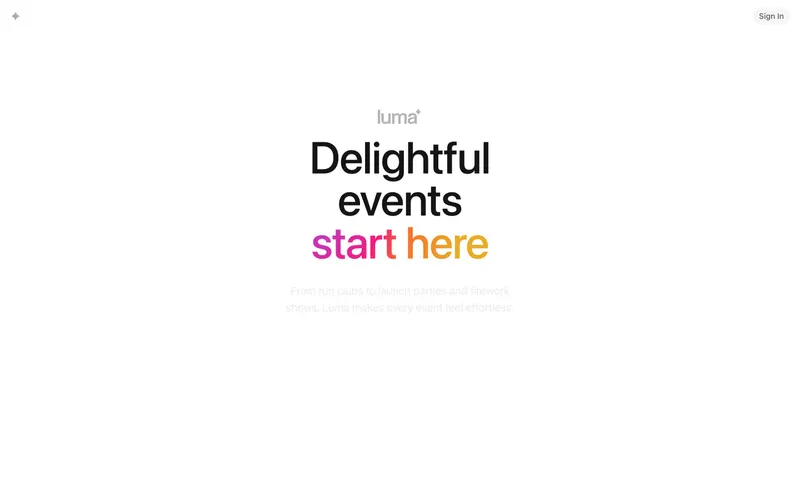
Similar because both use a minimal aesthetic and a colorful aesthetic.

Similar because both use a minimal aesthetic and a light aesthetic.
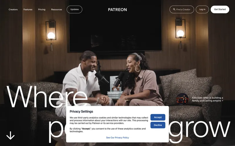
Similar because both use a light aesthetic and high-contrast typography.
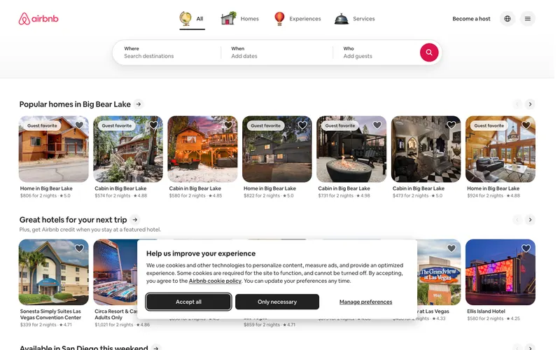
Similar because both use light, airy interfaces and a light aesthetic.

Similar because both use a minimal aesthetic and minimal layouts with generous whitespace.
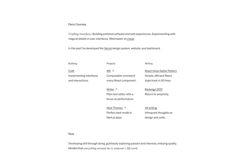
Similar because both use a minimal aesthetic and minimal layouts with generous whitespace.
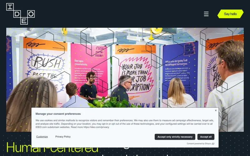
Similar because both use high-contrast typography and a minimal aesthetic.